# https://hihayk.github.io/scale/#4/6/50/80/-51/67/20/14/1D9A6C/29/154/108/white
colors = [
'#0A2F51',
'#0E4D64',
'#137177',
'#188977',
'#1D9A6C',
'#39A96B',
'#56B870',
'#74C67A',
]
colors.reverse()
plt.rcParams['figure.figsize'] = [9.8, 6]
plt.rcParams.update({'font.size': 8})
# to visualize -inf at log scale
eps = 1e-5
f, axes = plt.subplots(2, 2)
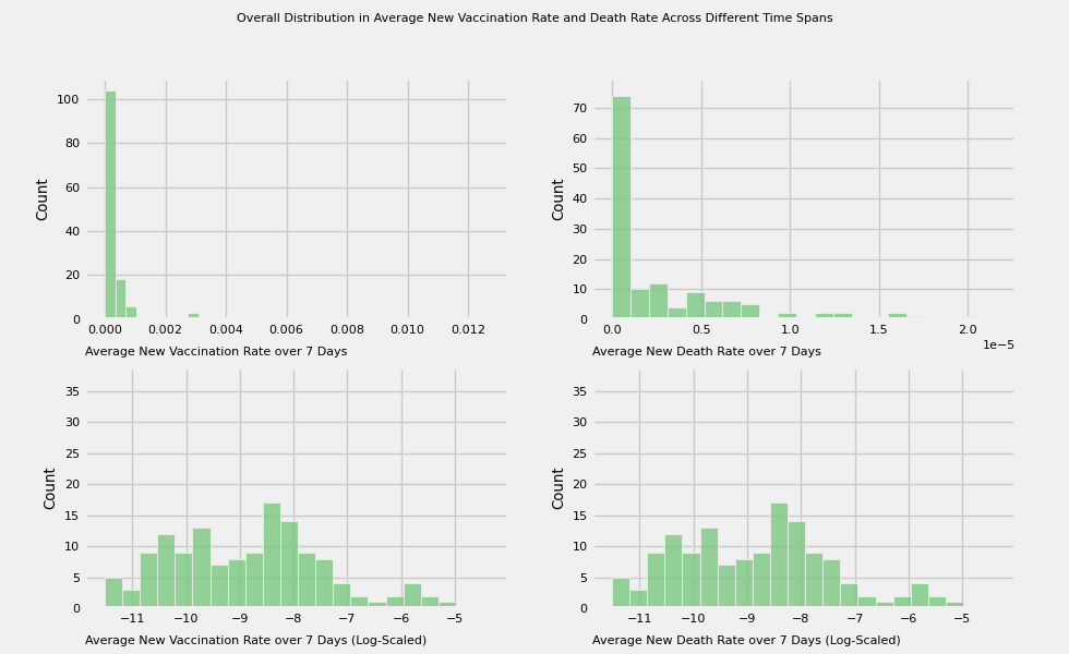
title = 'Overall Distribution in Average New Vaccination Rate and Death Rate Across Different Time Spans'
f.suptitle(title,
size='medium')
camera = Camera(f)
def plot_animation_hist(ax, var=None, label=None, color=None, bins=20, manual_entry=False, data=None):
if not manual_entry:
sns.histplot(x=var, data=df, ax=ax, color=color, bins=bins)
else:
sns.histplot(x=data, ax=ax, color=color, bins=bins)
ax.text(0, -0.15, label, transform=ax.transAxes)
ax.set_xlabel('')
# Plot the average new vaccination rate and death across different time spans:
# 7, 15, 30, 60, 180, 360 days
vac_to_plot = [f'new_vac_{number}_days' for number in time_intervals]
death_to_plot = [f'new_death_{number}_days' for number in time_intervals]
for i in range(len(vac_to_plot)):
plot_animation_hist(axes[0][0], vac_to_plot[i], color=colors[i],
label=f'Average New Vaccination Rate over {time_intervals[i]} Days')
plot_animation_hist(axes[0][1], death_to_plot[i], color=colors[i],
label=f'Average New Death Rate over {time_intervals[i]} Days')
plot_animation_hist(axes[1][0], color=colors[i], manual_entry=True, data=np.log(df[vac_to_plot[i]] + eps),
label=f'Average New Vaccination Rate over {time_intervals[i]} Days (Log-Scaled)')
plot_animation_hist(axes[1][1], color=colors[i], manual_entry=True, data=np.log(df[vac_to_plot[i]] + eps),
label=f'Average New Death Rate over {time_intervals[i]} Days (Log-Scaled)')
camera.snap()
animation = camera.animate(interval = 1500, repeat = True, repeat_delay = 0)
if not os.path.exists('visualizations'): os.makedirs('visualizations')
animation.save(f'visualizations/{title}.gif')
animation;